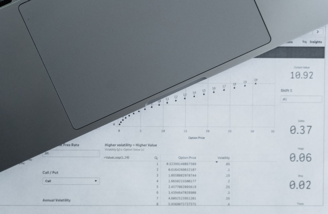
A spreadsheet stores detail efficiently. A presentation should reveal meaning efficiently. Turning rows and columns into slides starts by deciding which question the data needs to answer.
Define the business question
Do you need to explain growth, compare categories, find a problem, show progress, forecast performance, or recommend an action? That question determines which metrics and dimensions matter.
Choose the chart after the insight
Do not start by trying every chart type. First decide what relationship the audience needs to see. Use bars for comparisons, lines for change over time, and a small number of callout metrics when the exact value is the important point.
Reduce the amount of visible data
A presentation chart should not reproduce the spreadsheet. Remove irrelevant columns, secondary categories, gridlines, and labels that do not help explain the insight. Keep the full dataset available separately.
Use AI to help structure the story
An AI presentation workflow can help organize metrics into a sequence of context, finding, implication, and action. Verify every number and chart label against the source file before presenting.
Write slide titles as conclusions
Instead of titles such as 'Revenue by Region,' use a title that states the finding, such as 'West region growth accounted for most of the quarterly increase.' The audience should understand the point before reading the chart.