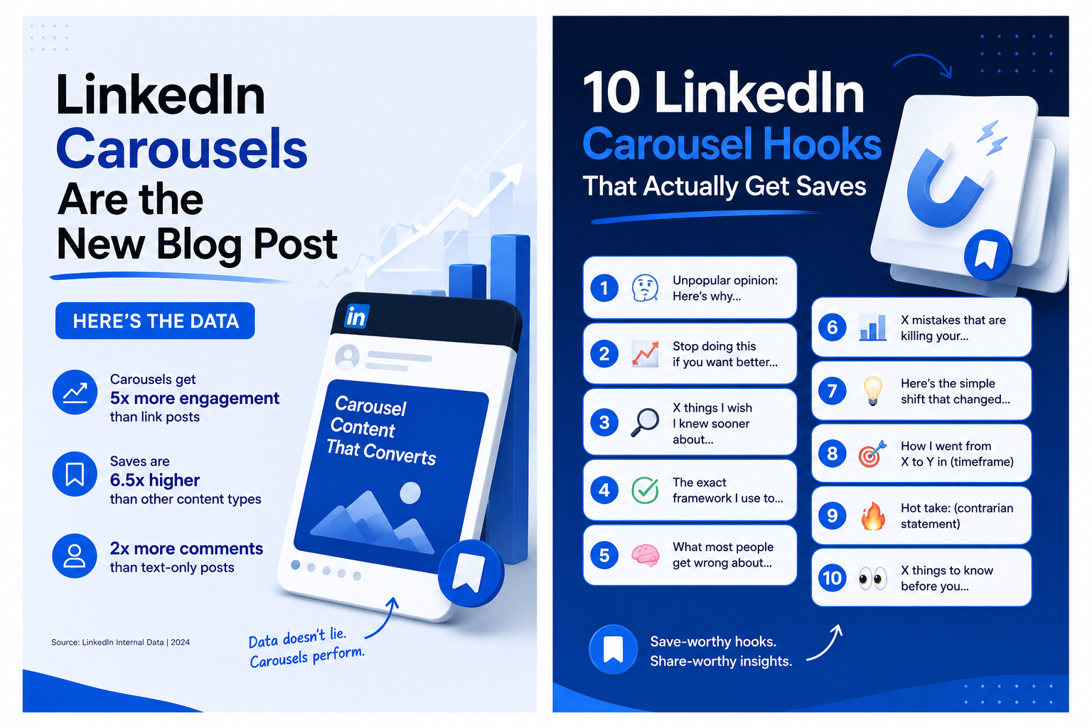
Every LinkedIn carousel has the same problem before it has any other problem: most people will never see slide two.
The first slide is doing the job of a headline, a thumbnail, and an opening line all at once — and it has roughly two seconds to convince someone mid-scroll that swiping is worth their time. Carousels already outperform other formats on dwell time and saves, but that advantage only kicks in if the hook earns the swipe in the first place.
The good news is that strong hooks follow recognizable patterns. Here are ten that consistently work, why each one functions the way it does, and how to adapt them to your own content.
1. The Counterintuitive Claim
Format: "[Common belief] is wrong. Here's what actually works."
This hook works because it creates a small cognitive itch — if the reader has held the common belief, they're now curious whether they've been doing it wrong. If they already disagreed with the common belief, they're curious whether you'll back up their instinct.
Example: "More content doesn't grow your audience. This does."
The key is that the claim needs to be genuinely contrarian to your audience, not just contrarian-sounding. A claim your audience already agrees with does nothing.
2. The Specific Number
Format: "[Number] [things] that [outcome]"
Numbers work because they signal scope and completeness before the reader commits to anything — "5 mistakes" tells you exactly what you're getting and how long it'll take.
Example: "7 LinkedIn habits that quietly kill your reach"
Specificity matters more than the number itself. "7 habits" performs better than "several habits" because it removes ambiguity about commitment.
3. The Before/After Frame
Format: "I used to [old approach]. Now I [new approach]. Here's what changed."
This hook works because it implies a story with a resolution — and stories create stronger pull than static claims. It also positions the content as earned experience rather than generic advice.
Example: "I used to spend 6 hours building one presentation. Now it takes 10 minutes. Here's what changed."
4. The Question That Implicates the Reader
Format: "Why does [common thing] keep happening to you?"
Direct questions work because they're harder to scroll past without at least a flicker of self-recognition. The best versions of this hook describe a frustration specific enough that the right audience feels seen.
Example: "Why does your content get likes but no comments?"
This format backfires if the question is too generic ("Want more engagement?") — it needs to name a specific, recognizable frustration.
5. The Data Point That Surprises
Format: "[Surprising stat]. Here's what it means for you."
A genuinely surprising number does a lot of work in very little space — it's concrete, it's credible-sounding, and it creates curiosity about the "so what."
Example: "Carousels get significantly more reach than text posts on LinkedIn. Most people are still posting text."
The stat needs to be real and sourced if you're going to reference it — vague or unsourced numbers erode trust quickly, especially with a professional audience that may fact-check.
6. The Framework Name-Drop
Format: "The [name] framework for [outcome]"
Naming a framework — even an original one — signals structure and repeatability. It tells the reader this isn't a one-off opinion; it's a system they can apply.
Example: "The 1-to-5 framework: how to turn one blog post into five pieces of content"
This works especially well if the framework name is memorable enough that people reference it later — that's when a hook becomes a recognizable idea rather than just an opener.
7. The Mistake Confession
Format: "[Number] mistakes I made [doing X] (so you don't have to)"
This hook works through a mix of relatability and value exchange — the reader gets to learn from your mistakes without making them, and confessions tend to feel more trustworthy than advice framed as "here's what you should do."
Example: "5 mistakes I made building my first AI-generated pitch deck"
8. The Direct Comparison
Format: "[Option A] vs [Option B]: which one actually [does the thing]?"
Comparisons work because they tap into existing decision-making — if someone is actively choosing between two things, content that promises to help them decide has built-in relevance.
Example: "Carousel vs presentation: which one should your next blog post become?"
This format performs best when both options are genuinely viable — a comparison that's clearly biased toward one side from the headline reads as an ad, not as content.
9. The "Nobody Talks About This" Angle
Format: "Nobody talks about [specific aspect], but it's the reason [outcome]"
This hook promises insider information — the implication is that most advice on this topic is incomplete, and this carousel fills the gap. It works best when the "this" is genuinely under-discussed, not just a restatement of common advice with a contrarian label slapped on.
Example: "Nobody talks about how much PDF structure affects AI presentation conversion — but it's the biggest factor in output quality"
10. The Step-by-Step Promise
Format: "How to [achieve outcome] in [number] steps"
This is the most straightforward hook on the list, and it works precisely because of that — it sets clear expectations (a process, a defined length, a specific outcome) and carousels are a format built for step-by-step content.
Example: "How to turn a blog post into a LinkedIn carousel in 5 steps"
What Makes a Hook Actually Work
Across all ten formats, a few principles repeat:
Specificity beats generality. "5 mistakes" beats "common mistakes." A named framework beats "a strategy." Specific numbers, names, and outcomes give the reader something concrete to evaluate in two seconds.
The hook should set up a payoff, not deliver it. A hook that gives away the entire insight on slide one removes the reason to swipe. The hook creates the question; the carousel answers it.
Match the hook to the content that follows. A hook promising "5 mistakes" needs to deliver exactly that — structure mismatches between the hook and the content frustrate readers who do swipe through, and that frustration shows up in lower completion rates and saves.
From Hook to Full Carousel
Writing a strong hook is the hardest part of a carousel — but it's only the first slide. Once you have a hook that fits one of these patterns, the rest of the carousel needs to deliver on it with the same clarity: one idea per slide, minimal text, and a clear visual hierarchy.
If you're starting from an existing blog post or article, an AI carousel maker can extract the core argument and structure it into a slide sequence — at which point your job shifts from "build the whole carousel" to "make sure the hook is strong enough to earn the swipe." Given how much of a carousel's performance depends on that first slide, that's exactly where your attention should go.
Final Thoughts
A carousel with eight excellent slides and a weak hook performs worse than a carousel with one excellent hook and seven decent slides — because most people will only ever see the hook. Before you spend time perfecting slide structure, design, or copy throughout, make sure slide one earns the swipe. Everything else only matters if it gets seen.