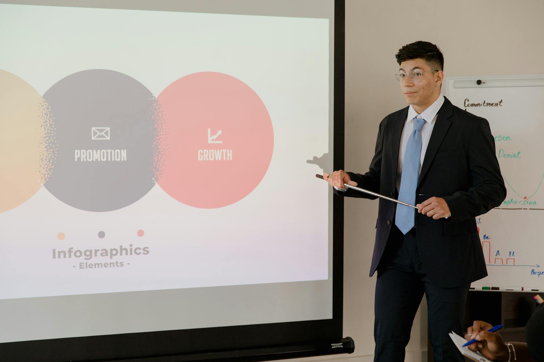
“One idea per slide” is a useful presentation rule because it gives an audience a clear point to understand before moving on. But taken literally, it can turn a connected explanation into a long sequence of fragments—or leave a slide looking empty while its key context sits elsewhere.
A more practical interpretation is one main takeaway per slide. Facts, examples, and visuals can support that takeaway, as long as they help the audience grasp the same point. The right amount of content depends on what you need people to notice, compare, remember, or do.
What “one idea” means in practice
An idea is the message you want someone to take away, not every individual fact on the slide. For example, “Customer renewals improved after onboarding changes” is one idea. A chart showing renewal rates, a short note about the change, and a callout marking the timing can all support it without creating three separate messages.
A useful test is to summarize the slide in one sentence. If the sentence uses “and” to join two claims that could each stand on their own, the slide may be carrying two ideas. If the supporting details all answer the same question—such as why renewals improved—they probably belong together.
- Main takeaway: what the audience should understand or remember.
- Supporting evidence: facts, examples, or visuals that make the takeaway credible.
- Context: labels or definitions needed to interpret the evidence.
When the rule makes a presentation clearer
Use one main takeaway per slide when the audience needs to follow a sequence of reasoning. In a project update, for example, one slide might explain that delivery is at risk because a supplier is late; the next might show the proposed response. Combining the risk, response, budget implications, and decision request on one slide can make it harder to see what needs attention first.
The rule is also helpful when a slide introduces a new or unfamiliar concept. A training presentation might first explain what a workflow stage does, then show a worked example on the next slide. Separating those steps gives people room to understand the concept before applying it. Clear slide titles help reinforce the point; a Slide Title Generator can help turn a topic label into a takeaway-led title.
When multiple elements belong on one slide
Do not split a slide just because it contains several objects. A comparison often needs multiple items to make one point. To explain why a team chose Vendor B, a single slide could show a compact comparison of cost, implementation time, and support alongside a clear recommendation. The table and recommendation work together: the takeaway is the choice and its rationale.
Keep related steps together when their relationship is the message. A simple process diagram with three stages may be easier to understand as one connected visual than as three slides that repeatedly reset the context. The same goes for a before-and-after example: putting both states side by side helps the audience notice what changed. Separate the elements only if the slide becomes crowded or viewers need to consider each step in depth.
How to handle charts, evidence, and caveats
A chart can contain many data points and still communicate one idea. Suppose a line chart shows monthly support requests rising after a product launch. The takeaway might be that demand increased and needs investigation. The chart provides evidence; an annotation can identify the relevant period. A second chart about customer satisfaction may belong on another slide if it supports a different conclusion.
Avoid stripping away context in the name of simplicity. A comparison needs consistent units and time periods; a percentage needs a clear denominator; a survey finding may need its question or audience noted. If a caveat changes how the audience should interpret the takeaway, keep it visible. If it is detailed methodology that only some people need, include it in notes or an appendix rather than shrinking the main content until it is hard to read.
Choose slide density for the audience and setting
A live presentation and a document meant to be read without a speaker have different needs. In a live talk, the presenter can explain supporting detail aloud, so slides can stay focused on the key message and evidence. A self-guided deck may need definitions, labels, or brief explanations that a presenter would otherwise provide. That does not mean every detail belongs on the slide, but it does mean the audience needs enough context to interpret it independently.
Consider the decision people must make, how familiar they are with the topic, and how much time they have to review the material. An executive summary might foreground a recommendation and a few decisive facts. A training deck may need an example, steps, and a check for understanding. A QBR Presentation Template or Training Presentation Template can offer a starting structure, but the content still needs to fit its audience.
A practical way to apply the rule
Start by writing the purpose of each slide as a sentence, not a topic label. “Risks” names a subject; “A supplier delay puts the launch date at risk” makes a claim. Then choose the evidence or visual that best helps the audience understand that claim. If you cannot state the takeaway, the slide may need a clearer purpose before it needs a design change.
Next, check whether every element contributes to that purpose. Remove repetition, move secondary detail to a later slide or appendix, and split the slide if two takeaways compete for attention. Keep a connected chart, comparison, or process together when separating it would hide an important relationship. For a fast readability check, use a Slide Word Count Checker, but treat word count as a prompt to review—not a fixed limit.
When you are building from existing material, Pekto can turn documents, reports, URLs, notes, or structured data into editable presentations and visual content. You can review and edit the generated content and presentation structure before export. Starting with an AI Presentation Maker can help create a draft; applying the one-takeaway test afterward keeps the final deck aligned with your message.